Ask anyone what color a link is and they'll say blue without blinking. Ask them "why are links blue?" and you'll get a shrug. It's one of those things we all learned without anyone teaching us, like knowing a red octagon means stop before you can read the word on it.
I'll admit I have a soft spot for the classic blue link and its sidekick, the purple visited link. Back when I was teaching myself HTML, a page full of purple links meant you'd done your homework. It was a passport full of stamps: proof of everywhere you'd already been. Somewhere along the way we traded that for buttons that say "Discover" and don't tell you what you're discovering.
So where did blue come from? The real story involves a university research lab, a 1993 browser update and a mystery nobody has fully solved.
Why are links blue? It started in a research lab
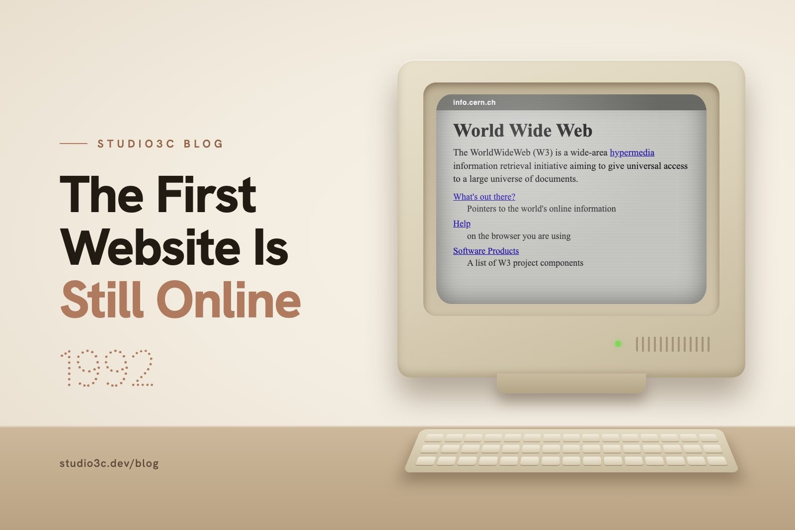
The earliest web browsers didn't use blue at all. Tim Berners-Lee, who built the first website, made the original WorldWideWeb browser on a NeXT computer with a grayscale screen, and its links were simply underlined. Other early browsers marked links with black text, outlines or highlighting.
The blue link itself goes back further. In the mid-1980s, Ben Shneiderman's Human-Computer Interaction Lab at the University of Maryland was studying how people read hypertext, the idea of clickable words inside a document. In 1985, his team developed light blue highlighting for links, which was later built into their hypertext system, HyperTIES. Shneiderman later explained the choice to Mozilla's blog: "blue was visible, on both white and black backgrounds and didn't interfere with retention." In plain English, people could spot it easily, and it didn't hurt how well they remembered what they'd read.
Then one browser update made it official
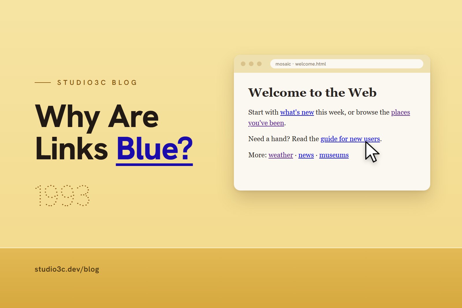
The moment blue went mainstream is surprisingly specific. On April 12, 1993, version 0.13 of Mosaic, a browser created by Marc Andreessen and Eric Bina at the University of Illinois's National Center for Supercomputing Applications, changed its default links to "blue and single solid underline for unvisited." Mosaic became hugely popular, and the browsers that followed kept its look. Netscape Navigator launched with blue links in 1994, and Internet Explorer 1.0 did the same in 1995.
Here's the honest part: nobody has documented exactly why Mosaic's developers picked blue. Shneiderman has said Berners-Lee cited his lab's research, though no one has shown that Mosaic's team took the idea directly from it. Color monitors were also becoming common, and blue was already showing up as a selection color in Windows. The likeliest answer is a mix of all three. Blue didn't win a design contest. It was in the right browser at the right moment, and millions of people learned the habit at the same time.
Why we never changed it
Once a whole generation learned that blue means clickable, changing it would have been like flipping every light switch in America so down means on. Nothing about "up" is better. It's just what everyone's hand already expects.
Usability research backs the habit up. In his 2004 guidelines for links, usability expert Jakob Nielsen wrote that "blue is still the color with the strongest perceived affordance of clickability." Affordance is a designer's word for how obviously something tells you how to use it. A door handle says pull. A blue underlined word says click.
In the same guidelines, Nielsen added that other colors work almost as well. That's the real lesson. Blue isn't magic. A clear, consistent signal is.
What this means for your website
Your links don't have to be blue. They do have to be obvious. Here's how to keep them that way.
Pick one link color and stick to it. Your brand color is fine. Just use it for links and nothing else, so visitors learn the rule on their first scroll.
Don't color or underline text that isn't clickable. Nielsen specifically warns against underlining anything that isn't a link, and against blue text that isn't a link, even if blue isn't your link color. Underlining a phrase that goes nowhere is like painting a door on a wall: people will walk into it.
Don't rely on color alone. The web's accessibility guidelines (WCAG) say color shouldn't be the only way to show meaning, since not everyone sees color the same way. If your links aren't underlined, WCAG's guidance is to make their color contrast clearly with the surrounding text. Adding an underline when someone hovers over or tabs to a link is a smart extra signal.
Let visited links look visited. A slightly duller shade of your link color tells returning visitors where they've already been. It's the passport stamp, still doing its job.
Give links room. Tiny links crammed together are like an elevator panel with pea-sized buttons. Someone is going to end up on the wrong floor, especially on a phone.
Make the words do the work. "Click here" makes people read the whole sentence to figure out where they're going. "View our spring menu" tells them before they tap.
The best design is the one nobody notices
The blue link has lasted more than 30 years because it never asks you to think. You see it, you know what it does, and you move on. That's the bar for every link and button on your site: obvious enough that nobody has to wonder.
If your visitors are hunting for where to click, that's exactly the kind of thing I fix with small business web design at Studio3C. Get in touch and let's make your next step impossible to miss.